Camino Nuevo: graduating to a new look & feel
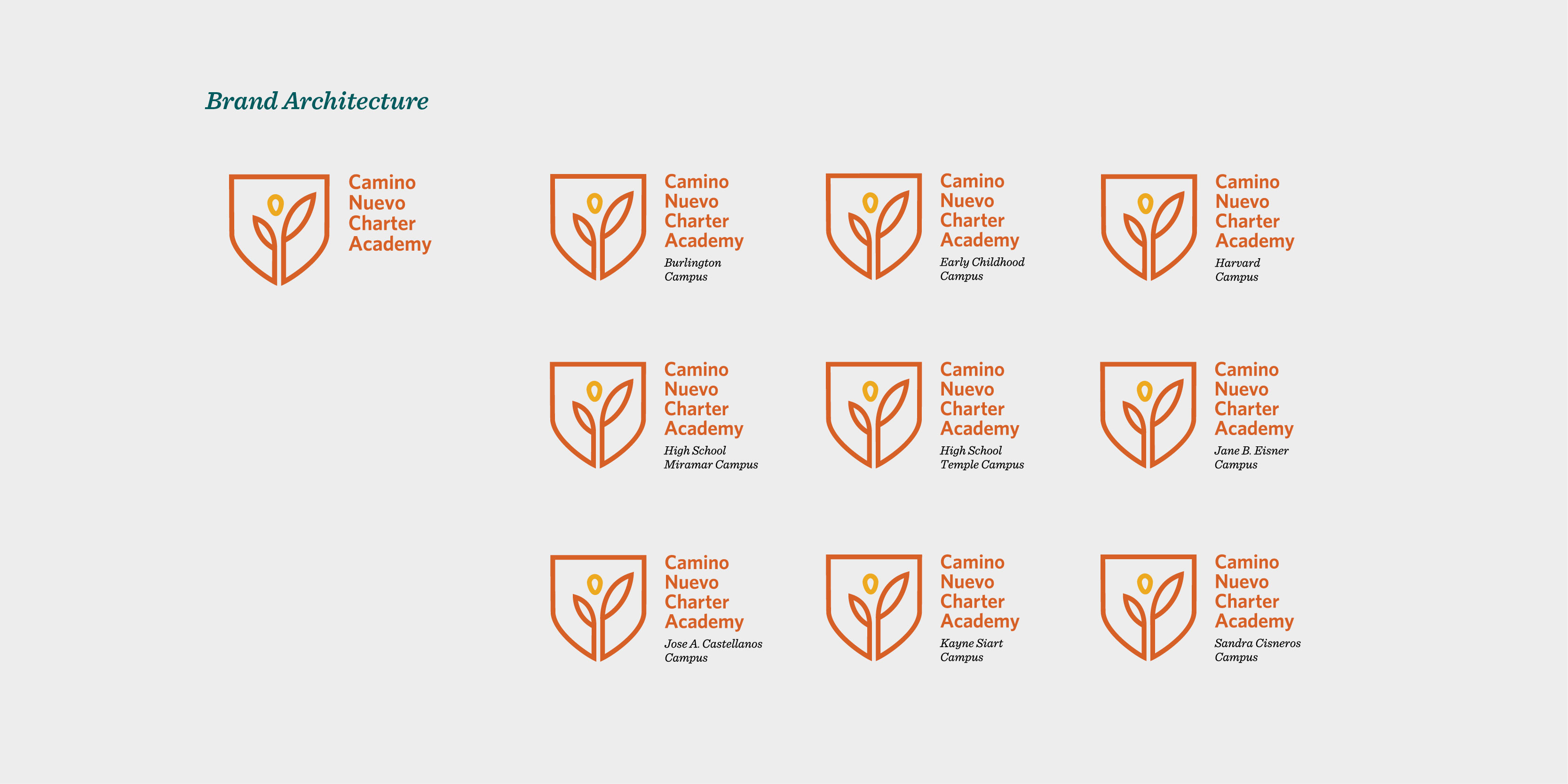
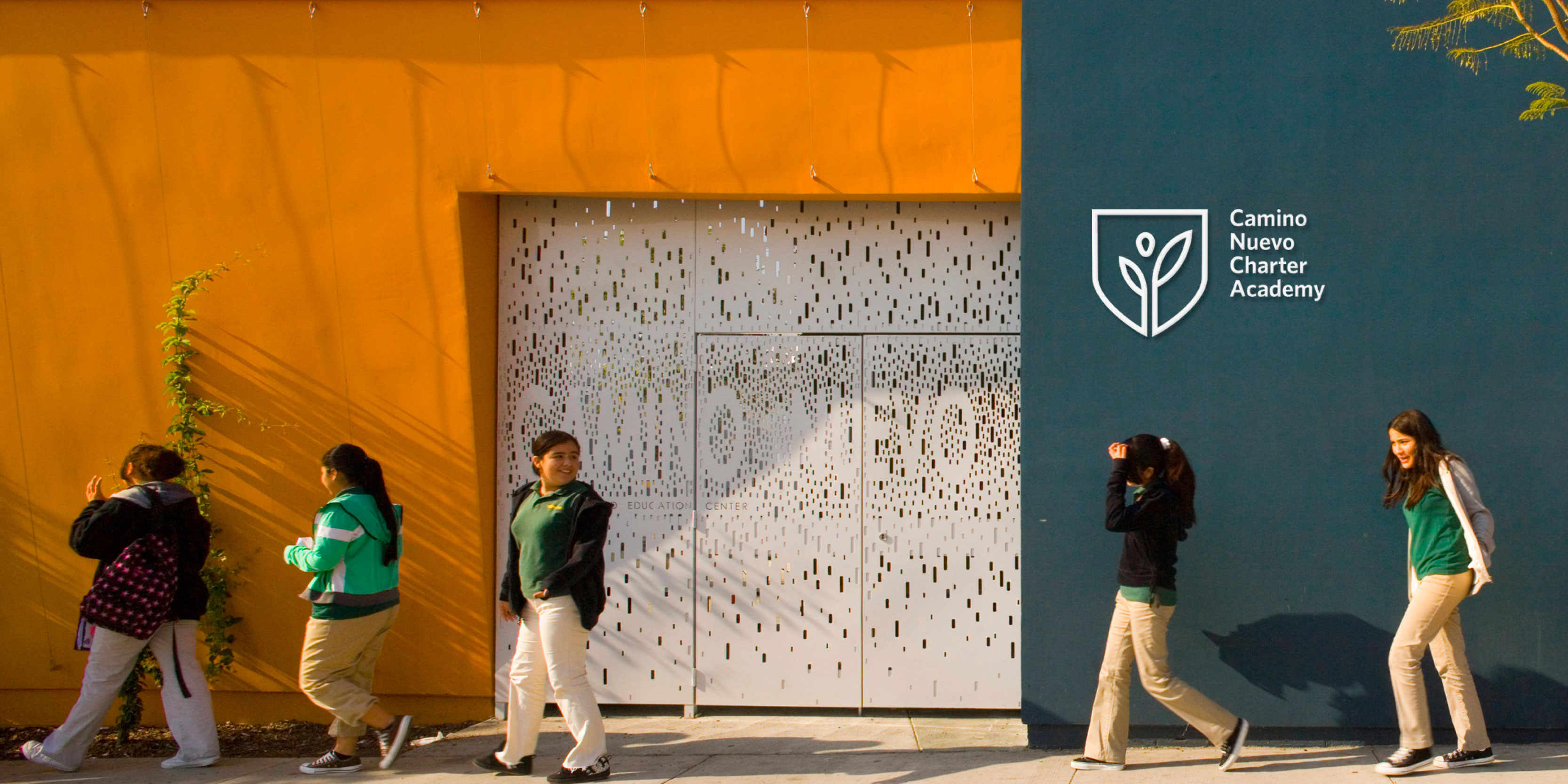
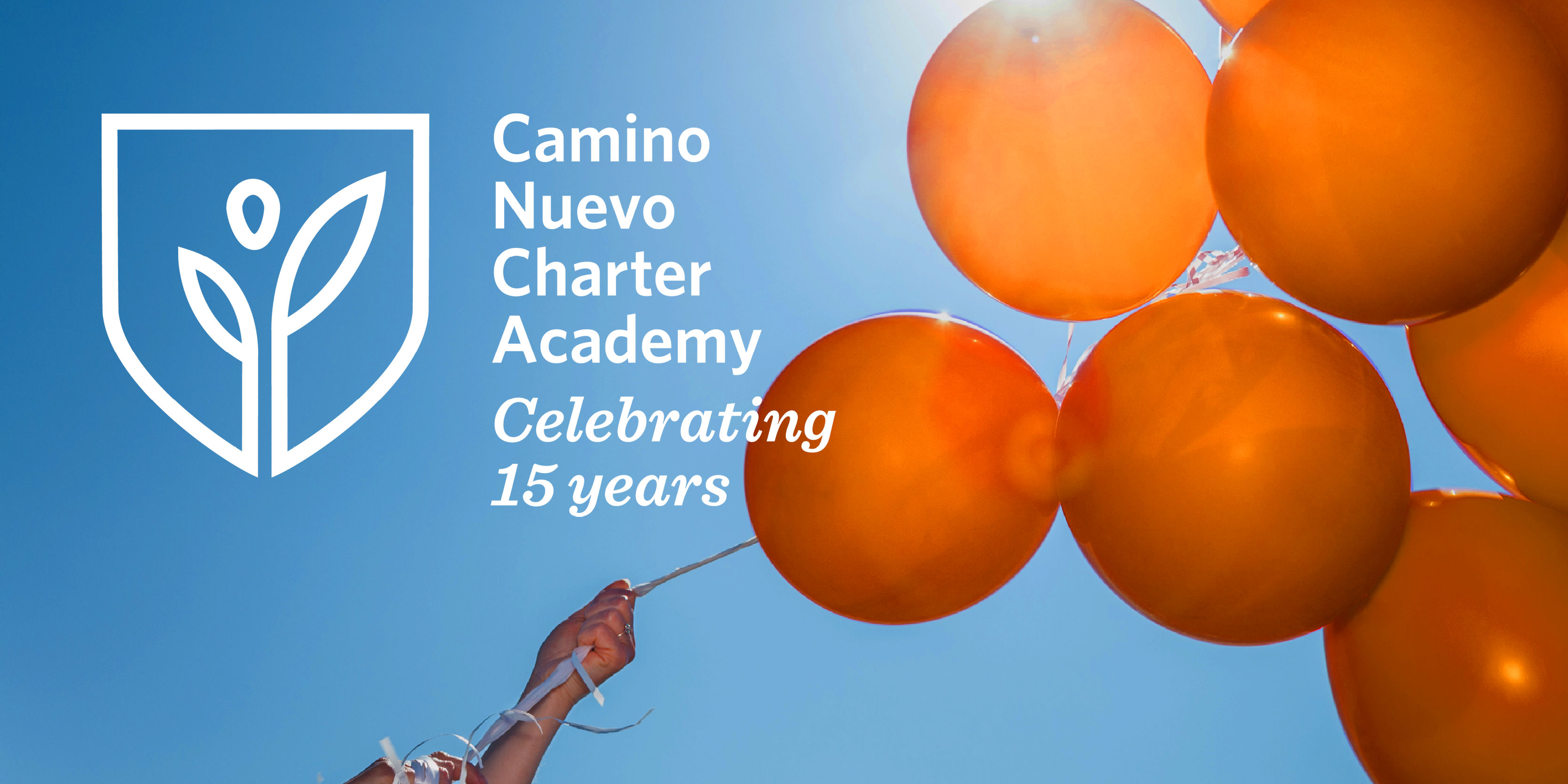
Bilingual workshops with key stakeholders distilled key concepts to inform a new brand identity for this high-performance charter academy in L.A.’s inner city. The color palette speaks to the warmth of the organizational culture. The mark embodies metaphors that were key for stakeholders, with a look that conveys the high standards expected from the students.